
TASTE OF VIETNAM
Brand Identity, Social, Merchandises
Presented by Ao Dai Canada, Taste of Vietnam is an Annual Festival Showcasing Vietnamese Food, Culture & Arts in Toronto.
The Goal
The festival's rebrand is to reposition the current perception of Vietnam away from being just a rural country to reflect the country's socio-economic development, with a focus on urban spaces and street food culture.


LOGO
Logo made with flexibility for future iterations.
“Danh Da” typeface was created by Vietnamese designer Giang Nguyen, combining various references from 20th century women's magazine in Vietnam. The typeface has traces of Art Deco influences during the French colonial era and bares similarity to Vietnam's War Propaganda poster style during that time.
The identity is based on the rawness of Vietnamese street culture, specifically on the iconic "Concrete Drilling service" ad which is a staple local graffiti vandalism on every urban surface of the country. Its colour palette is drawn from the urban scenery of Vietnam, from local signages and flyers to old concrete walls and plastic chairs where people often enjoy street food on.


SHAPES STUDY


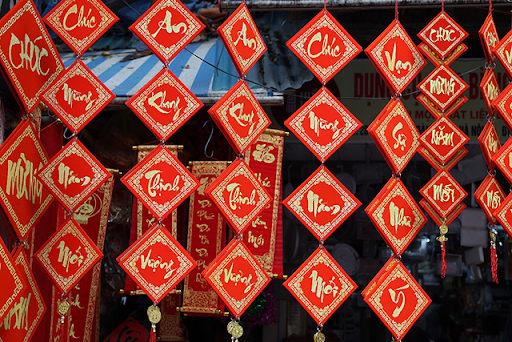
The shapes represent Vietnamesetraditional cone hat, street vendors' baskets and Lunar New Year calligraphy paper.
POSTERS


SOCIAL POSTS


Social videos featuring raw and real sound of Vietnamese street food culture: the sound of the city and its people, the quick and skillful movements of the vendor making food on the spot.
MERCHANDISES


